
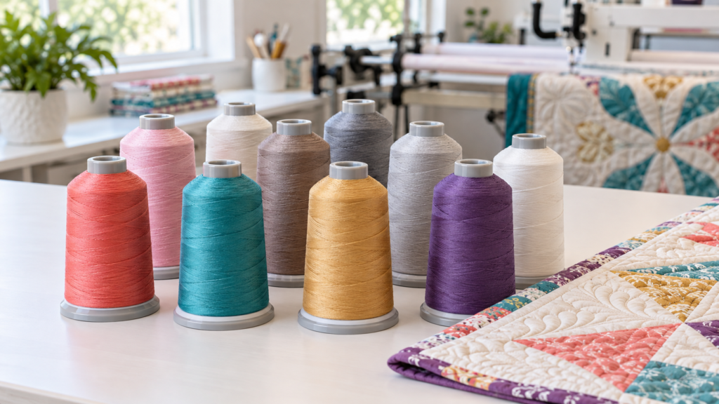
Choosing a thread color can feel surprisingly difficult. A quilt may contain dozens of fabrics, several values, and more than one strong color. The good news is that quilting thread does not need to match every fabric. The best choice usually supports the overall quilt and creates the amount of visible texture you want.
Before selecting a color, decide whether you want the quilting to blend into the quilt top or become part of the design. That single decision will narrow the choices and make the rest of the process much easier.
First Decide Whether the Quilting Should Blend or Stand Out
Choose a blending color when the piecing should be the focus
A blending thread allows the fabric, blocks, and appliqué to remain the stars of the quilt. The stitching still adds texture, but it is less noticeable from a distance. This is often a comfortable choice for traditional quilts, quilts with detailed piecing, keepsake quilts, and tops containing many different colors.
Choose a contrasting color when you want the quilting to be visible
A contrasting thread makes the edge-to-edge pattern easier to see. It can add movement and personality to areas of solid fabric or large open spaces. Because contrast also makes every stitch more noticeable, it should be chosen intentionally. If you love the quilting design and want it to share the spotlight, contrast can be beautiful.
Look at the Quilt as a Whole
Do not try to match the thread to one favorite fabric or a single block. Step back and identify the color family that appears most often across the entire quilt. Also notice whether the overall quilt reads as light, medium, or dark. A thread that sits near the quilt’s average color and value will usually travel across multiple fabrics more quietly than a very light or very dark choice.
A helpful rule: when choosing between two similar colors for a multicolor quilt, the slightly darker option often blends more naturally across both light and dark fabrics. However, test it first if the quilt contains large areas of white, cream, or very pale fabric.
Consider the Back of the Quilt
The backing matters because the quilting will be visible there too. Think about whether you want the stitched pattern to blend with the backing or show clearly. Your longarm quilter may use a coordinating bobbin thread rather than the identical top-thread color. If the top and bobbin colors are dramatically different, tiny tension variations can sometimes become more noticeable, so discuss the combination before quilting begins.
Audition the Thread Before Making a Final Choice
A spool or a color shown on a computer screen can be misleading. Thread looks different when it becomes a thin stitched line surrounded by fabric. Whenever possible, unwind a strand of thread and lay it across several parts of the quilt, including the lightest fabric, the darkest fabric, and the largest areas of color.
Check the thread in natural daylight and indoor lighting. Then take a photograph from several feet away. The photograph can help you see whether one section of the quilt suddenly attracts too much attention.
Thread Choices to Avoid
- Avoid choosing from a screen alone. Monitor settings and website photographs can shift colors. Use a physical thread sample when available.
- Avoid an accidental high contrast. Bright white on dark fabric or black on pale fabric will make the stitching dominant and will reveal every change in direction.
- Avoid matching only one fabric. A perfect match in one block may look unrelated across the rest of the quilt.
- Avoid assuming the thread must match every color. One well-chosen neutral or dominant color is usually more cohesive than frequent color changes for edge-to-edge quilting.
- Avoid ignoring the backing. The top-thread and bobbin-color plan should work with both sides of the quilt.
- Avoid selecting variegated thread without checking every shade. One unwanted color in the sequence may repeatedly cross a fabric where it looks distracting.
- Avoid treating thread color separately from the quilting pattern. A dense or detailed pattern makes thread more visible, while an open pattern may appear softer even in the same color.
A Simple Thread Color Checklist
☐ Do I want the quilting to blend or stand out?
☐ What color family dominates the quilt when I view it from several feet away?
☐ Is the quilt mostly light, medium, or dark?
☐ How does the thread look across the lightest and darkest fabrics?
☐ Will the color also work with the backing?
☐ Does the quilting pattern make the thread more or less noticeable?
☐ Have I viewed a real strand of thread in more than one type of lighting?
The Best Color Is the One That Supports Your Quilt
There is rarely only one correct thread color. Several shades may work, but each will create a different effect. Start by deciding how visible you want the quilting to be, choose from the quilt’s overall palette, and audition the thread across several fabrics. When in doubt, a well-chosen neutral or medium-value color is often the most forgiving option for edge-to-edge quilting.
Online Quilting Studio offers curated thread choices to make the decision easier. When you place an order, select the color you prefer or ask for guidance based on your quilt top, backing, and chosen quilting pattern
Follow Online Quilting Studio for more practical quilting tips, preparation guides, and future blog topics.
You create the quilt top. We’ll help you finish it beautifully.